Prototype - updated
Showing posts with label Ambroise Bellec. Show all posts
Showing posts with label Ambroise Bellec. Show all posts
5/15/14
5/8/14
4/17/14
#thursdayapps: Good Weather.

Unique Feature Games. This app is designed so that each particular condition unlocks a special mini-game where you get to play with the components of the conditions.
Features Celcius or Fahrenheit • 5-day forecast • Current conditions along with temperature, precipitation chance, cloud coverage percentage, and wind speed • Cities/Location
Pros
Pros
- Simple, clean, iconic and aesthetically pleasing representation of the current weather conditions along with temperature, precipitation chance, cloud coverage percentage, and wind speed.
- You can also tap the temperature to bring up the five-day forecast, but the pictorial conditions (icons) are the definite highlight of the app. The designers used information hierarchy wisely.
- Each condition has a different background color. I find this helps with differentiation, and I could almost tell which color denotes which condition.
- Each particular condition unlocks a special mini-game where you get to play with the components of the conditions. For example, when it’s sunny, you can play a Doodle Jump style endless jumping game with the sun. There are different games for snowing, raining and cloud shooting game. I’m not spoiling the surprise, you should download the app and discover what games there are.
- The app keeps track of your high scores for each mini-game and levels you’ve unlocked so far. Each one features an exquisite visuals and soundtrack, making it a joy to play.
- The app supports multiple cities with accurate and updated statistics.
- Games can be played even if there’s no Internet connection
- 3 preloaded weather conditions from 3 different cities (Oz, Winterfell and Neverland), which mean you have 3 unlocked games from the get go.
- Succinct instructions for games, they are simple enough to figure out what to do.
- For kicks, you can type in any imaginary cities in popular books/movies. I did that. I typed in Narnia and it gives me perpetually sunny. Free cities - overcast. Westeros - didn’t work.
Cons
- There’s no predictions on hourly weather for the day. I was wondering if it’s going to stay, for example Sunny the whole day, or just at that particular moment of the day.
Smile factorGood Weather makes me want to check the weather every day to find a new form of conditions, and unlock a new mini-game. Because of that, I don’t really mind that I’m unclear or unsure if it’s going to stay sunny, overcast, etc for the whole day or just at that particular moment.
The VerdictThe app displays really simple weather info, it gives what you need for a quick glance, and draws you in with the allure of the games. Each one isn’t much by itself, but together the collection provides plenty of enjoyment. The only extra to add now would be Game Center leaderboards and achievements to tie to the mini-games, and daily conditions.
The VerdictThe app displays really simple weather info, it gives what you need for a quick glance, and draws you in with the allure of the games. Each one isn’t much by itself, but together the collection provides plenty of enjoyment. The only extra to add now would be Game Center leaderboards and achievements to tie to the mini-games, and daily conditions.
#thursdayapps: Dumbo
Search DUMBO retail and restaurants, take a tour, explore the neighborhood like never before. Whether it’s a tech meetup, a new gallery opening, the launch of a new website, or a hackathon.
This app exists for a multitude of reason. Mostly, however, we wanted to turn the neighborhood inside out and expose the creative work and people of DUMBO as well as the great local businesses and events. We hope that through this app, we can bring greater exposure to everything in DUMBO.– Tendigi. Dumbo App developer.

Features News • Community • Events • Current Weather & Forecast • Search Businesses & Restaurants • Check-in to your favorite locations with Foursquare • Take a tour and discover new things
Pros
- Clean and clear visual design
- Fast and easy access to get information
- In one glance, you get Weather forecast, Noteworthy news about Dumbo, Events, Hot Spots and a really short introduction of these places. And how far away the featured hotspot is from you.
- How do we get all that in one page? The app uses simple scroll animation and excellent information hierarchy to accomplish all those.
- When you swipe up, you get 3 day weather forecast.
- The tour lists the places you can visit, all categorized.
- You can skip a certain place if you aren’t interested, and pause the tour or resume it whenever you feel like.
- It then maps the route from your current location to the next listed place.
- Events lists all upcoming events neatly. When you click on it, you then get details of the event, including program itinerary for the night.
Cons
- It has its own Twitter, with posts updated everyday. I’m not sure how the Tweets help this app in anyway
- The tours lists as many 10 things to do, but not a feature where you can find out about the place. I think even a short introduction might help, especially if the name of the place doesn’t give any clues whatsoever.
Smile factor
Truly all in one app that promotes DUMBO. It’s got weather forecast, details, events and tours complete with mapping feature.
The Verdict
Although i like this app a lot, I can’t get past the fact that it has no personality and very factual. Perhaps it’s just my own subjective view.
#thursdayapps: SpotSetter
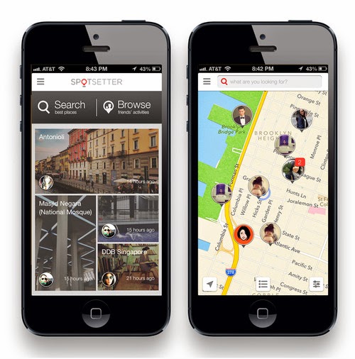
Unique Feature A Facebook account is required to login, the app’s recommendations are prepared and personalized, by pulling data from your social networks. It takes a while, but it gives you the confidence and/or illusion (your pick) that it is personalized. Here’s the really promising official description:
- Spotsetter provides personalized recommendations for places to go. "Where to go" is socially relevant and we help answer that through the vast amount of content your friends have already created across all social networks.
- These friends set the standard for the best spots and we call them Spotsetters. Not only do they explore all these great places, they also love to share opinions about them.
- Spotsetter helps you find these amazing spots and what your friends have to say about them. Find friendly tips, reviews, and photos about these places, no matter where they’ve been shared.
Features Fast map navigation • Integration with Facebook, Twitter, Instagram and Foursquare • Bookmarks • Search • Browse friends’ activities
Pros
- Clean, easy to use.
- Home screen provides a quick glance at friends’ latest photos/places they’ve been to.
- Recommendations are entirely based on your social network friends, from the places they have been to.
- You can set up filters by time frame, who the posts are from (two categories: me or friends), and which social networks to pull data from.
- I like that there’s the map view that shows friends facebook profile pictures in the “pins” dropped on locations. As I can quickly glance through which places and which friends have been to which places. From there I can delve deeper and see their comments and pictures.
- Auto-complete tool helps you find all the places, friends, and things they’ve said.
Cons
- There are only 4 recommendations, every time the app is launched, depending which friends’ activities are the latest.
- You can’t choose which friends’ travel or places you’d want to feature.
- There isn’t a pull down or refresh feature, which for me can be confusing. I’d want to constantly update the recommendations.
- As of now, it seems that my featured recommendations are dominated by instagram users that I follow. I wonder what happen to my Facebook friends who constantly check-in.
- There is no way to deactivate the networks in the app, you have to email to request for disconnection.
- The map feature only works on one city, the more you zoom out, the less friends you will see.
Smile factor
Entirely friends’ recommendations and comments of a place.
The Verdict
I’m constantly wondering if the places displayed are the most up to date, but i love the map view, with little “faces” on it. Makes it easier too, to scan and find certain places. I don’t like the fact that I can’t automatically de-activate certain networks. As of now, it seems that my featured recommendations are dominated by instagram users that I follow. I wonder what happen to my Facebook friends who constantly check-in. I’d like to see more improvements in the app. I feel like I’ll get bored of it easily, though the premise and concept is brilliant.
4/10/14


3/20/14
Project #2. Ideas.
Our ideas are:
1. A platform where you can barter your skills or things with stuff you need.
-Users: Artists, designers, entrepreneurs, etc. who believes in the sharing/gift economy.
- Objective: To create a platform to meet and barter, and start conversations around the gift economy.
- How it works: A has a space to let but needs logos and identities. B needs a space and have design skills. A + B can find each other through this platform and barter. (eg. ourgoods.org)
2. A dating app that recommends places for tailored dating experiences.
- Users: Couples or singles looking for inspiration and ideas
- Objective: To ease the stress and hassle of planning dates
- How it works: User will input criterias for the date, eg. type of date (blind date, date night, first date), mood (romantic, adventurous, off the beaten path, educational), how many people (2, group date), location (current location, union square), budget, day (monday or friday, etc) and time (afternoon, night). The app will then recommend a list of places and things to do. Users might be able to book and plan the date from the app.
3. Organization project manager as an extension of google drive or dropbox. (eg. tidy app.)
- How it works: User starts by picking out a typeface. The app will then suggest potential matches. After the user's chosen their matched typefaces, the app will then direct users to the website/type foundry to get them.
1. A platform where you can barter your skills or things with stuff you need.
-Users: Artists, designers, entrepreneurs, etc. who believes in the sharing/gift economy.
- Objective: To create a platform to meet and barter, and start conversations around the gift economy.
- How it works: A has a space to let but needs logos and identities. B needs a space and have design skills. A + B can find each other through this platform and barter. (eg. ourgoods.org)
2. A dating app that recommends places for tailored dating experiences.
- Users: Couples or singles looking for inspiration and ideas
- Objective: To ease the stress and hassle of planning dates
- How it works: User will input criterias for the date, eg. type of date (blind date, date night, first date), mood (romantic, adventurous, off the beaten path, educational), how many people (2, group date), location (current location, union square), budget, day (monday or friday, etc) and time (afternoon, night). The app will then recommend a list of places and things to do. Users might be able to book and plan the date from the app.
3. Organization project manager as an extension of google drive or dropbox. (eg. tidy app.)
- Users: Busy designers
- Objective: To ease workflow
- How it works: Busy designers don't have the time to organize their project files, this app will rename their files and group them into folders such as images, typefaces, etc. Similar to the package file feature in InDesign.
- How it works: Busy designers don't have the time to organize their project files, this app will rename their files and group them into folders such as images, typefaces, etc. Similar to the package file feature in InDesign.
4. Typography “dating” app.
- Users: Designers who wants to use different fonts for their project easily.
- Objective: The app makes using different font on a project easier with suggestions and references.
- How it works: User starts by picking out a typeface. The app will then suggest potential matches. After the user's chosen their matched typefaces, the app will then direct users to the website/type foundry to get them.
We are still weighing our decisions. Will update after class.
2/27/14
Ambroise's 2nd wireframes + design


I started designing the app, and prototyping it with and online platform called Flinto (it's pretty much the same thing as POP but with pngs and jpegs). Got my two roommates to try it out, they really like it!, Some of the flow isn't too solid enough yet. Although Flinto doesn't give much flexibility in terms of swipes and zooms etc... the app did make sense.
The whole payment method and even activity had a cool NYC helvetica white on black with bold lines feel to it which is exactly what I'm going for, but the type is too small in some areas and I will need to start "airing" it out by maybe adding more screens or simply going back to the drawing board to re-design the flow of payment. Right now I am particularly happy with the flow of payment, it's just that it is not clear enough what the balance is, or how many options you actually have. Maybe adding more intermediary views, like credit cards on a single view, reciept on another.... let's find out.
2/20/14


Concept for navigation across MyMTA platform

I am taking a different approach to the MTA card refill app. Using a NYC subway branding image (helvetica black, solid colors) and inspiration from the Mailbox app and Google app, I have created a swipe-able menu on the left hand side that navigates throughout the app.


2/11/14
Ambroise app Idea
For my NYC app, I want to create a simple system to "top-up" credit, or time, on one's metrocard. It would work with a credit/debit card, the user would input a metrocards ID number and link to his or her debit/credit card. EASY!
Further features can include a family mode, where "mom" takes care of her kids bus / subway passes ( for example)
Further features can include a family mode, where "mom" takes care of her kids bus / subway passes ( for example)
2/6/14
Hello

Hello,
My name is Ambroise, I am a third year communication design student, with a growing interest in web and mobile design / development. I recently switched from android (which I had for almost three years) to iphone (ios7). I won't be turning back to android in a while as the interface Apple offers suits my needs much more than my previous device.
ios7 guideline, interesting points:
Avoid using the same color in both interactive and non-interactive elements.
Don’t take space away from the content people care about.
Use a navigation bar to give users an easy way to traverse a hierarchy of data.
My current favorite app is the built-in calendar app that apple integrates into ios7. It's simpleness and fluidity really makes it for me. It synchronises to my gmail calendar, which I also open on my laptop very often, and keeps everything tidy and in place.
Paris App
Assignment: CROISSANT
Our team members :
Aarti Ruparell
Kyungjoo Hyun
Ambroise Bellec
using the terms : Paris / Productivity / Young Women ( 20 - 30 yrs old ) ,
... we created an app we call CROISSANT, which effectively turns a daily schedule into a detailed itinerary, guiding the user throughout the day and telling her when to leave a location in order to be in time for the next task, when to take the subway / bus, how expensive it will all be... it is a citymapper meets google maps (directions) based in Paris! It really focuses on all the "negative space" in a daily schedule and gets rid of unpredictable tardiness / elevator rides / missed subway etc...
The design is flat for Ios7, using French color ways.
The two screens we mocked up are the login screen and the calendar view (no itinerary yet!)


Our team members :
Aarti Ruparell
Kyungjoo Hyun
Ambroise Bellec
using the terms : Paris / Productivity / Young Women ( 20 - 30 yrs old ) ,
The design is flat for Ios7, using French color ways.
The two screens we mocked up are the login screen and the calendar view (no itinerary yet!)
Subscribe to:
Posts (Atom)