Prototype - updated
Showing posts with label NatashiaTjandra. Show all posts
Showing posts with label NatashiaTjandra. Show all posts
5/15/14
5/8/14
4/17/14
#thursdayapps: Good Weather.

Unique Feature Games. This app is designed so that each particular condition unlocks a special mini-game where you get to play with the components of the conditions.
Features Celcius or Fahrenheit • 5-day forecast • Current conditions along with temperature, precipitation chance, cloud coverage percentage, and wind speed • Cities/Location
Pros
Pros
- Simple, clean, iconic and aesthetically pleasing representation of the current weather conditions along with temperature, precipitation chance, cloud coverage percentage, and wind speed.
- You can also tap the temperature to bring up the five-day forecast, but the pictorial conditions (icons) are the definite highlight of the app. The designers used information hierarchy wisely.
- Each condition has a different background color. I find this helps with differentiation, and I could almost tell which color denotes which condition.
- Each particular condition unlocks a special mini-game where you get to play with the components of the conditions. For example, when it’s sunny, you can play a Doodle Jump style endless jumping game with the sun. There are different games for snowing, raining and cloud shooting game. I’m not spoiling the surprise, you should download the app and discover what games there are.
- The app keeps track of your high scores for each mini-game and levels you’ve unlocked so far. Each one features an exquisite visuals and soundtrack, making it a joy to play.
- The app supports multiple cities with accurate and updated statistics.
- Games can be played even if there’s no Internet connection
- 3 preloaded weather conditions from 3 different cities (Oz, Winterfell and Neverland), which mean you have 3 unlocked games from the get go.
- Succinct instructions for games, they are simple enough to figure out what to do.
- For kicks, you can type in any imaginary cities in popular books/movies. I did that. I typed in Narnia and it gives me perpetually sunny. Free cities - overcast. Westeros - didn’t work.
Cons
- There’s no predictions on hourly weather for the day. I was wondering if it’s going to stay, for example Sunny the whole day, or just at that particular moment of the day.
Smile factorGood Weather makes me want to check the weather every day to find a new form of conditions, and unlock a new mini-game. Because of that, I don’t really mind that I’m unclear or unsure if it’s going to stay sunny, overcast, etc for the whole day or just at that particular moment.
The VerdictThe app displays really simple weather info, it gives what you need for a quick glance, and draws you in with the allure of the games. Each one isn’t much by itself, but together the collection provides plenty of enjoyment. The only extra to add now would be Game Center leaderboards and achievements to tie to the mini-games, and daily conditions.
The VerdictThe app displays really simple weather info, it gives what you need for a quick glance, and draws you in with the allure of the games. Each one isn’t much by itself, but together the collection provides plenty of enjoyment. The only extra to add now would be Game Center leaderboards and achievements to tie to the mini-games, and daily conditions.
#thursdayapps: Dumbo
Search DUMBO retail and restaurants, take a tour, explore the neighborhood like never before. Whether it’s a tech meetup, a new gallery opening, the launch of a new website, or a hackathon.
This app exists for a multitude of reason. Mostly, however, we wanted to turn the neighborhood inside out and expose the creative work and people of DUMBO as well as the great local businesses and events. We hope that through this app, we can bring greater exposure to everything in DUMBO.– Tendigi. Dumbo App developer.

Features News • Community • Events • Current Weather & Forecast • Search Businesses & Restaurants • Check-in to your favorite locations with Foursquare • Take a tour and discover new things
Pros
- Clean and clear visual design
- Fast and easy access to get information
- In one glance, you get Weather forecast, Noteworthy news about Dumbo, Events, Hot Spots and a really short introduction of these places. And how far away the featured hotspot is from you.
- How do we get all that in one page? The app uses simple scroll animation and excellent information hierarchy to accomplish all those.
- When you swipe up, you get 3 day weather forecast.
- The tour lists the places you can visit, all categorized.
- You can skip a certain place if you aren’t interested, and pause the tour or resume it whenever you feel like.
- It then maps the route from your current location to the next listed place.
- Events lists all upcoming events neatly. When you click on it, you then get details of the event, including program itinerary for the night.
Cons
- It has its own Twitter, with posts updated everyday. I’m not sure how the Tweets help this app in anyway
- The tours lists as many 10 things to do, but not a feature where you can find out about the place. I think even a short introduction might help, especially if the name of the place doesn’t give any clues whatsoever.
Smile factor
Truly all in one app that promotes DUMBO. It’s got weather forecast, details, events and tours complete with mapping feature.
The Verdict
Although i like this app a lot, I can’t get past the fact that it has no personality and very factual. Perhaps it’s just my own subjective view.
#thursdayapps: SpotSetter
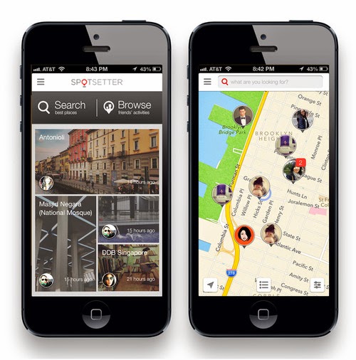
Unique Feature A Facebook account is required to login, the app’s recommendations are prepared and personalized, by pulling data from your social networks. It takes a while, but it gives you the confidence and/or illusion (your pick) that it is personalized. Here’s the really promising official description:
- Spotsetter provides personalized recommendations for places to go. "Where to go" is socially relevant and we help answer that through the vast amount of content your friends have already created across all social networks.
- These friends set the standard for the best spots and we call them Spotsetters. Not only do they explore all these great places, they also love to share opinions about them.
- Spotsetter helps you find these amazing spots and what your friends have to say about them. Find friendly tips, reviews, and photos about these places, no matter where they’ve been shared.
Features Fast map navigation • Integration with Facebook, Twitter, Instagram and Foursquare • Bookmarks • Search • Browse friends’ activities
Pros
- Clean, easy to use.
- Home screen provides a quick glance at friends’ latest photos/places they’ve been to.
- Recommendations are entirely based on your social network friends, from the places they have been to.
- You can set up filters by time frame, who the posts are from (two categories: me or friends), and which social networks to pull data from.
- I like that there’s the map view that shows friends facebook profile pictures in the “pins” dropped on locations. As I can quickly glance through which places and which friends have been to which places. From there I can delve deeper and see their comments and pictures.
- Auto-complete tool helps you find all the places, friends, and things they’ve said.
Cons
- There are only 4 recommendations, every time the app is launched, depending which friends’ activities are the latest.
- You can’t choose which friends’ travel or places you’d want to feature.
- There isn’t a pull down or refresh feature, which for me can be confusing. I’d want to constantly update the recommendations.
- As of now, it seems that my featured recommendations are dominated by instagram users that I follow. I wonder what happen to my Facebook friends who constantly check-in.
- There is no way to deactivate the networks in the app, you have to email to request for disconnection.
- The map feature only works on one city, the more you zoom out, the less friends you will see.
Smile factor
Entirely friends’ recommendations and comments of a place.
The Verdict
I’m constantly wondering if the places displayed are the most up to date, but i love the map view, with little “faces” on it. Makes it easier too, to scan and find certain places. I don’t like the fact that I can’t automatically de-activate certain networks. As of now, it seems that my featured recommendations are dominated by instagram users that I follow. I wonder what happen to my Facebook friends who constantly check-in. I’d like to see more improvements in the app. I feel like I’ll get bored of it easily, though the premise and concept is brilliant.
4/16/14
#thursdayapps: Monument Valley.
 |
| Gif by Luke Plunkett |
This MC Escher inspired perceptual puzzle game is over too soon. There are only 10 levels. The visual design is really beautiful and the experience enchanting, you can’t help but want more. There isn’t many words in Monument Valley and that’s because you don’t need it. We follow Princess Ida's journey, through mind-bending gameplay and melancholy music. Her journey is certainly felt, not read.
Jaz Rignall of USgames.com writes:
It packs brilliant moments of discovery: smack-your-forehead situations where you're completely flummoxed, but then are utterly delighted when you figure out what you need to do. It has moments of wonder as something comes into view, or something unexpected happens, or when pieces of architecture literally click into place. And it all plays through an audio-visual experience that is of the utmost quality.
HOW IT WORKS:
Guide the silent princess Ida through ancient abandoned cities, their twisted walkways turning at my touch to produce impossible paths. My job was to facilitate her journey, tapping the screen to manipulate either select bits of scenery or rotate entire stages. Broken roads, turned to the correct angle, became whole. (Source: Mike Fahey).
I will be re-playing Monument Valley from stage 1 as soon I hit the post button.
4/10/14
Thursday Apps: Triplagent.
I'm immediately drawn to this app because of its beautiful and minimalist design. With so much written about New York City, it's hard to find truly new and unique suggestions. Triplagent is filled with original suggestions from some of the city's most interesting people. It lets you choose places by "vibes" and some of its filters are "odd", "thrill", "bad ass".
Image and design by Taras Kravtchouk.


3/20/14
Project #2. Ideas.
Our ideas are:
1. A platform where you can barter your skills or things with stuff you need.
-Users: Artists, designers, entrepreneurs, etc. who believes in the sharing/gift economy.
- Objective: To create a platform to meet and barter, and start conversations around the gift economy.
- How it works: A has a space to let but needs logos and identities. B needs a space and have design skills. A + B can find each other through this platform and barter. (eg. ourgoods.org)
2. A dating app that recommends places for tailored dating experiences.
- Users: Couples or singles looking for inspiration and ideas
- Objective: To ease the stress and hassle of planning dates
- How it works: User will input criterias for the date, eg. type of date (blind date, date night, first date), mood (romantic, adventurous, off the beaten path, educational), how many people (2, group date), location (current location, union square), budget, day (monday or friday, etc) and time (afternoon, night). The app will then recommend a list of places and things to do. Users might be able to book and plan the date from the app.
3. Organization project manager as an extension of google drive or dropbox. (eg. tidy app.)
- How it works: User starts by picking out a typeface. The app will then suggest potential matches. After the user's chosen their matched typefaces, the app will then direct users to the website/type foundry to get them.
1. A platform where you can barter your skills or things with stuff you need.
-Users: Artists, designers, entrepreneurs, etc. who believes in the sharing/gift economy.
- Objective: To create a platform to meet and barter, and start conversations around the gift economy.
- How it works: A has a space to let but needs logos and identities. B needs a space and have design skills. A + B can find each other through this platform and barter. (eg. ourgoods.org)
2. A dating app that recommends places for tailored dating experiences.
- Users: Couples or singles looking for inspiration and ideas
- Objective: To ease the stress and hassle of planning dates
- How it works: User will input criterias for the date, eg. type of date (blind date, date night, first date), mood (romantic, adventurous, off the beaten path, educational), how many people (2, group date), location (current location, union square), budget, day (monday or friday, etc) and time (afternoon, night). The app will then recommend a list of places and things to do. Users might be able to book and plan the date from the app.
3. Organization project manager as an extension of google drive or dropbox. (eg. tidy app.)
- Users: Busy designers
- Objective: To ease workflow
- How it works: Busy designers don't have the time to organize their project files, this app will rename their files and group them into folders such as images, typefaces, etc. Similar to the package file feature in InDesign.
- How it works: Busy designers don't have the time to organize their project files, this app will rename their files and group them into folders such as images, typefaces, etc. Similar to the package file feature in InDesign.
4. Typography “dating” app.
- Users: Designers who wants to use different fonts for their project easily.
- Objective: The app makes using different font on a project easier with suggestions and references.
- How it works: User starts by picking out a typeface. The app will then suggest potential matches. After the user's chosen their matched typefaces, the app will then direct users to the website/type foundry to get them.
We are still weighing our decisions. Will update after class.
3/19/14
#thursdayapps: Tidy

Tidy organizes your photos with just a simple swipe.
With smartphones becoming ubiquitous, the way we store memories and references change. We end up taking photos of everything, from things we find funny and want to share, to stuff we want to remember, to beautiful moments. We accumulate tens of photos everyday, all stored in one big mess in our Camera Roll.
Tidy aims to help you reorganize your photos in one swipe. When you launch the app, the photos will be categorized as "untidy". You can organize the mess in a few different ways, by time (1 hour, 6 hours or day, week, month or year), by location (500m, 1km, 10km, 100km or 1000km), and by shape. This feature is the most unique compared to other photo apps, it will go through your photos an categorize them by squares, portraits, landscapes, panoramas and even screenshots. Needless to say, I start categorizing my photos by shape, as I take tonnes of screenshots.


3/13/14
#thursdayapps : Kennedy App
"An iOS app that freezes moments" – that's the best description for Kennedy App.

As you open the app, tiny circles swoop through a larger circle reminiscent of a time machine at work, which is both the point and visually striking, but there’s only one thing to do: hit “now".
And the moment is frozen. In my screen is see:
today at 5.31pm.Half past fiveon a clearThursday afternoonin New York.In the news the headline read We Mapped Our Boss's Office with This Slick New 3-D Camera.
I like the app for it's minimalism, fuss free and intimate premise. The only thing users can customize is where the app should pull headlines from. For my case, it's wired.com
3/6/14
Project#1: &sounds. Design and Prototype.
Next steps after last week's user testings:
1. Decide on improving either prototype 1 or 2.
2. POP prototype
I've decided to work on Prototype 2.
Changes:
- Added a secondary navigation, so it'll less steps for users to explore new sounds, access their sounds, and check their feed.
- MY FEED. Changed the square "thumbnail format to a band. This is to reduce the amount of information overload on the feed and sounds are usually presented in a list. (Signal to ration & using elements of the real world into the design principles).
- CATEGORY. Colors assigned are now determined by sound category, suggested by computer, to give a bit of a surprise.
- SEARCH. "Side Nav" Search function is combined together with "Explore", as it was confusing for users. Instead of 2 search functions with 2 different filters, now it's 1 and users will be able to add categories.
- EDIT. This function follows the search filters, to make it more uniform with the rest of the app. And also to minimize confusion. (On hind sight, I think it'll be confusing, as users will need to apply filter & listen to the changes they've made).
- SIDE NAV now has lesser options. "My playlist" isn't something that's as important as "my sounds" or discovering new sound. User can access it through "my profile".

Here's the POP Protoype.


2/27/14
Project #1: &sounds. 2 Prototypes. Wireframe iteration 3.
 |
| Credit: solidifyapp.com |
The improved prototypes, below.
Changes made based on the result of user testing #1 and feedback.
USER TESTING #1
AppMapV3a-1 (wireframes 3) – Prototype
Participants:
- 1 grad student, an iPhone user
- 1 grad student, an Android user
- 1 developer, an Android user
Results:
Discover
- What happens if there's someone who's recorded an illegal or vulgar soundbite?
- What are these grey pins?
- How do I go back?
Record
- Are these grey pins my recordings or others? It's pretty similar with the other one.
- I like the editing feature
- It's like instagram for sounds!
 |
| Credit: solidifyapp.com |
USER TESTING #2
AppMapV3a-1 (wireframes 3) – Prototype
Participants:
- 4 app savvy mates
Results:
Side Nav
- Clicking the Logo to go to Home is causing a bit of confusion. Users tapped on the Hamburger menu button first, before trying others.
- Include Home/Discover buttons?
Discover
- List icon isn't clear
- I didn't get that it's a list view
- I like how the list view is instagram-ish
- The Map gives me a sense of satisfaction.
- The Map can be overwhelming.
- How do I follow other people?
- Why do I need to declare where I am? It isn't clear that I have to declare my whereabouts.
User Profile
- List icon very similar to Hamburger
Record
- Are these grey pins my recordings or others? It's pretty similar with the other one.
My Sounds (music player)
- How do i go back to Map view to play a different sound?
Overall
- Being consistent from screen to screen (transition, behavior, etc)
- I like how the place matters here.
- I like how the Log in is not upfront, users only log in/sign up when they share sounds.
AppMapV4 – Prototype 2
Participants:
- the same 4 app savvy mates
Results:
Discover
- How about including a category such as mystery/surprise me sounds? For users who don't check-in and etc.
My Feed
- How do I go back to previous screen?
- It can get confusing & difficult to listen to many sounds at once
Music Player
- Play Next track button isn't clear.
- Can't I play the sound while in list mode?
- "•••" button throws me off
- How do I hide the comment, like, etc buttons?
Overall- the same 4 app savvy mates
Results:
Discover
- How about including a category such as mystery/surprise me sounds? For users who don't check-in and etc.
My Feed
- How do I go back to previous screen?
- It can get confusing & difficult to listen to many sounds at once
Music Player
- Play Next track button isn't clear.
- Can't I play the sound while in list mode?
- "•••" button throws me off
- How do I hide the comment, like, etc buttons?
- Simpler than Prototype 1
- Very audio based, location isn't very important here
- I'm just recording, less about the place/location
- I like how it's fast & easy for me to access the audio and record

- Decide which iteration/approach
- Animate the background animation
- Insert sound
2/26/14
#thursdayapps: Reporter

At random times of the day, Reporter asks you to fill in a mini survey, questions such as “What are you doing?, Who are you with?, How many cups of coffee did you drink today?, How did you sleep?”. You can also customize the questions. This allows for monitoring broad trends in your lifestyle. Reporter is an activity-tracking app that aggregates your responses into visualizations and charts of the user’s life.
The app is really easy to use, intuitive and only 2 effortless gestures are needed: tap and swipe. Some of the questions are can be answered with a yes or a no, while others allow you to type in. Each time you report, the app also pulls in various pieces of information like the current weather, current location (FourSquare API), how many steps you’ve taken today (iPhone 5s’ M7 motion coprocessor), and how noisy it is around you (iPhone’s mic).

I am a big fan of Felton's, and I got the app at $3.99. Reporter requires plenty of manual tracking – the creator argues that it’s the best way to answer the most interesting questions. Part of me wishes for Fuely, the little Nike Fuel cheerleader who gives you a little dance when you completed your goal, and the other wishes for automatic data inputs. The no non-sense questions left much to be desired after a while, unless like Felton, you are a data nut. And yet, there’s something appealing about the simple, purist graphics with 5 customizable color schemes.
Of course, you can export the data visualizations and print the 'posters' out for you to admire.
2/20/14
Project #1: &sounds. Wireframe iteration 2.
Here's the POP prototype for a preview. I'm conducting user testings based on this wireframe.
Will report findings.
Below you can find:
A new App Map, a detailed one.

And here're the wireframes.


Will report findings.
Below you can find:
A new App Map, a detailed one.
And here're the wireframes.
#thursdayapps: Carrot

A judgmental to-do app that keeps you on task with personality and attitude.
Pros
- Interactive and entertaining. Carrot “talks” to you. For one of your rewards, it’ll give you a kitten. And it’ll remind you to feed it…..which you have to type in his command space.
- Feels like you have a personal assistant or secretary
- Carrot gives you encouragement and reproves you whenever you deserve it.
- Carrot also gets angry, when you irritate it. For eg. I poked his ocular sensor a couple of times, just to see how it’ll react. It warned me before it got angry. The screen turns black and its type is red, its speech got snarkier, just like an irritated human.
- You are emotionally invested in the app
- Clean design, intuitive. eg. strikes list off by swiping to the right. Small bar at the bottom of Carrot’s command, indicates how far (many tasks need to be completed) you are to the next level.
Cons
- Not all of the basic features like editing a task, moving the tasks in order of importance are available from the get go. You have to complete tasks to earn them as rewards.
- There’s no feature to indicate which task is important or urgent, unless you move them yourself.
Smile factor If you actually finish doing the things you add to the list, you’ll be rewarded. But if you don’t … things get much more fun if you don’t. Carrot has 2 personalities, he’s quite schizo. The happy Carrot is nurturing and encouraging, and showers you with praise and rewards for completing tasks. The angry Carrot hates you simply because you exist. He’s snarky and sacarstic, and enjoy showering you with insults.
I’m not sure which personality I like more. I traded Clear and Any.do for Carrot. What can i say, how many apps out there reward you with a virtual kitten? Or get mad at you?

2/13/14
Project #1. App Map & Wireframes
&sounds aim to archive the sounds that surround us when we take the time to emerge from this bubble. And in time, our memories of a place. You can record, listen and tag your own acoustics with a place. The user will be able to set up a profile for himself, monitor activity occurring on his recordings such as comments and likes, and bookmark the recordings he likes.
This is my thesis. I'm building a collective sound archive.


2/9/14
#thursdayapp: Threes!
Threes! is infinitely better than Candy Crush and Flappy Bird. Original game design. No in app purchases. Brilliantly simple but endlessly playable. Smile factors such as cute animations and sound effects definitely keep me coming back for more.
Gameplay consists of sliding numbered blocks onto one another to form higher numbers, but some important rules turn an easy concept into a challenging puzzle. Only like numbers can combine together, for instance, 3 and 3, to form a 6, which can then only combine with another 6. 1 and 2 are limited to combining with each other.
Tis a simple game, but difficult to master.

________________________________________________________
UPDATE:

Gameplay consists of sliding numbered blocks onto one another to form higher numbers, but some important rules turn an easy concept into a challenging puzzle. Only like numbers can combine together, for instance, 3 and 3, to form a 6, which can then only combine with another 6. 1 and 2 are limited to combining with each other.
Tis a simple game, but difficult to master.
________________________________________________________
UPDATE:
Here’re some suggestions for improvement:
- Retry button. I don’t get why the retry button is way up on the left. It isn’t user friendly, the game is designed for a single gesture : swipe. I play the game with just one hand (which I’m sure many of us do). The stretch for my thumb to tap that button is quite annoying, it’s in the OW zone (as written by Scott Hurff). Move it to the top right please, and replace that twitter button. I think the tweet/share button could be integrated with typing the player’s name after the score. Having said that, I’ll probably forgive the game designers because of the much enjoyment I derived from playing the game.
- Give me my score now. Please? Why do I need to swipe to see my score and swipe again to type my name in the scoreboard? I think a smoother transition without having to swipe would be nice.
- Previous games. The other thing I don’t really get is why would I want to see my previous games, they display only the last move on these boards. If I can tap on it and be shown what and where I did wrong, I wouldn’t mind. All I want to do is to continue playing the game (start with a new board) and beat the game!
Subscribe to:
Posts (Atom)